April 7, 2012
Did a Balanced Allocation Work Better than an All-Stocks Allocation for Past Retirees?
The “asset allocation” choice is one of the toughest and most important decisions that investors face.
There is general agreement that your asset allocation has a huge impact on your long-term and short-term returns and on the volatility of returns.
Most asset allocations articles that explore how your portfolio might grow if invested in different proportions of stocks, bonds and cash, rely on assumptions and averages. However, assumptions and averages can be very mis-leading. In particular many articles fail to adjust for inflation. Much of the advice on this topic seems designed to make life easier for investment advisors rather than to maximize or optimize results for investors.
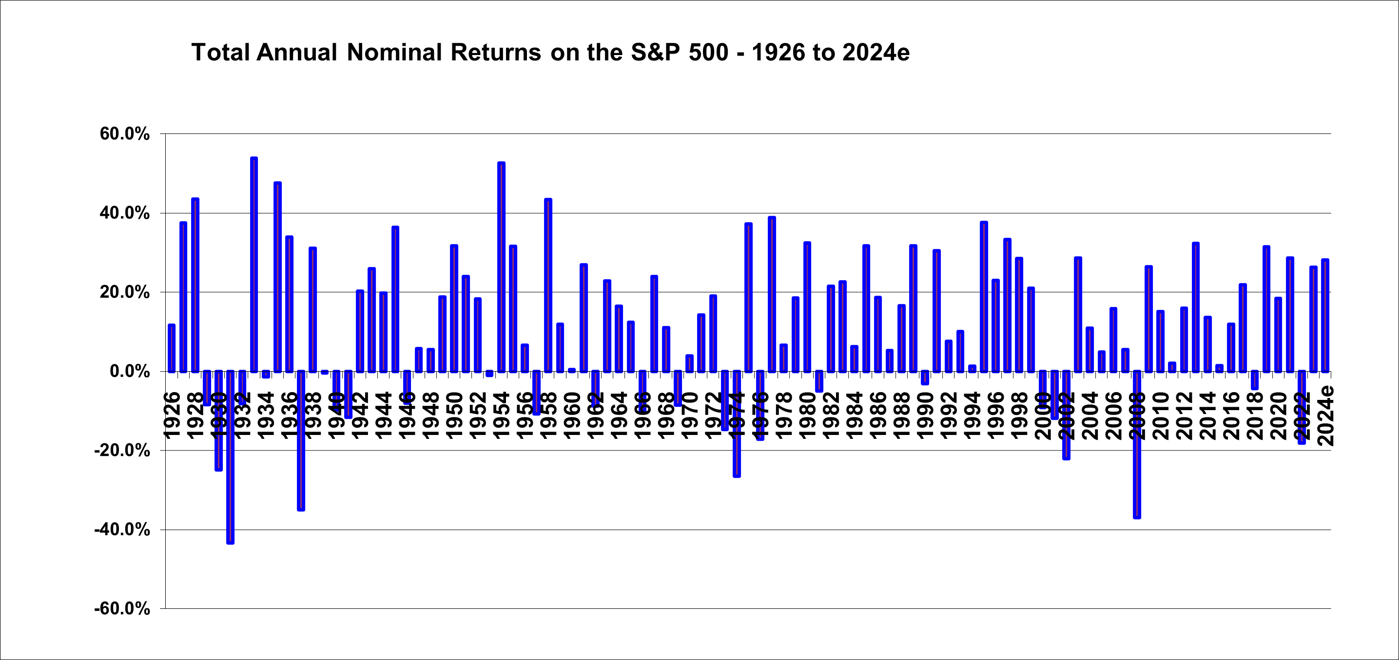
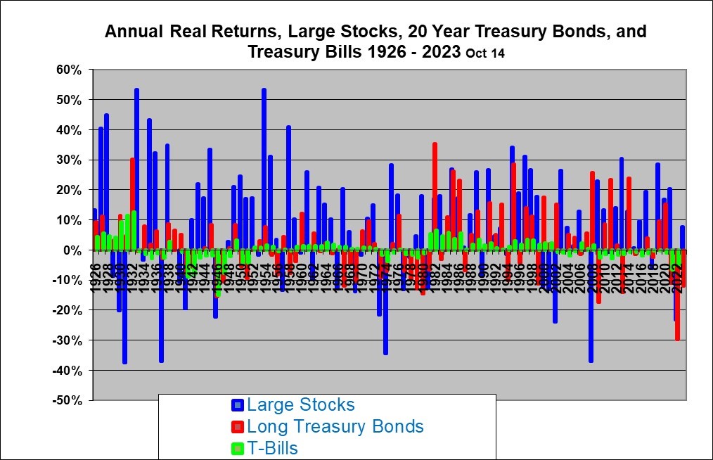
Rather than speculate on how investments might grow with different asset allocations, it seems to me that it is best to start by looking at results from actual past data. For illustration, I looked at scenarios where people retired in various years. I have data for stocks, corporate bond and cash returns for calendar years starting in 1926. This data is from a publication called Stocks, Bonds, Bills and Inflation which is published annually by Ibbotson Associates, now a division of Morningstar.
The following article shows what actually would have happened to people who started with a “pot” of money at the beginning of each year from 1926 to 1982 and who then withdrew money for 30 years (to simulate retirement). This is based on actual U.S. total return indexes for stocks, corporate bonds and cash (T-bills). Our data is also adjusted to account for inflation. By adjusting the data for inflation we can simulate a retirement income that adjusts for inflation and we insure that a $40,000 withdrawal at year one is adjusted up by inflation to have the same $40,000 purchasing power, adjusted for inflation, 30 years later.
How Retirement Savings Really Declined (or grew) in Retirement with Different Asset Allocations based on Actual Market Returns
This article presents some rather startling conclusions about how retirement portfolios with different asset allocations would have actually declined in the past and what the annual volatility has been. Based on this, I found that “average” results are not in fact “typical” because there has been a huge variation around the average, even over 30-year periods.
The results suggest that a 100% asset allocation to equities (all stocks, no fixed income) historically worked out well, over about 93% of all historical 30 year periods (although with some truly ugly volatility along the way). Only in 2 out of 57 cases did a traditional balanced asset allocation approach work out far better and in another 2 cases the balanced approach was marginally better. In 3 cases both the all stocks (all equity) and the balanced approaches ultimately ran out of money. That leaves 50 cases out of 57 where the (all stocks) 100% equity approach worked out better, and often far better.
Retirement savings draw-down scenarios are often worked out using assumed average returns that are expected to be achieved. The return assumptions tend to range from 6% to 8% per year (on a nominal basis before adjusting for inflation). Usually, it is assumed that funds are invested in a balanced manner, between stocks, corporate bonds and short-term cash deposits. Usually it is assumed that a certain amount will be withdrawn from the portfolio each year.
Under most of these scenarios, your savings are projected to decline at a steady rate over the years. Often, much is made of the need to preserve capital or avoid negative returns in any given year. Usually the fact that inflation eats away at purchasing power is ignored or glossed over.
But the actual data tells a far different and rather surprising story…
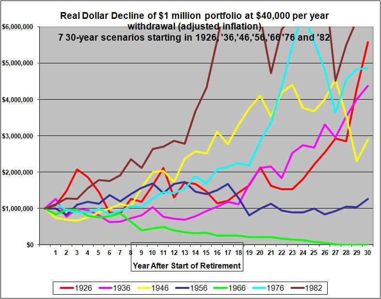
Imagine that $1,000,000 was available at the start of a retirement period that was to last 30 years. And imagine that 4% of the original amount or $40,000 per year (adjusted for inflation each year ) is withdrawn each year. (Recent studies suggest that withdrawing more than about 4% causes a risk of running out of money and 4% is known as the safe withdrawal rate). Based on past results, how would the portfolio decline (or possibly grow)? What do the results look like based on investing all the money in only stocks and based on dividing the money between stocks, bonds, and short-term cash?
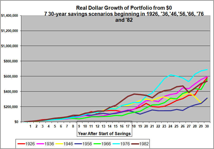
When we applied this scenario to someone who began a 30-year retirement period in each of 1926, 1936, 1946, 1956, 1966 1976 and 1982 (’82 is included because it ends in 2011), using actual historical market index total return data, the results were quite startling.
We compared two approaches. One asset allocation approach was to invest the portfolio strictly in stocks, 100% equities as represented by the S&P 500 large stock index in the U.S. The other approach invested the funds in a traditional balanced asset allocation manner with 60% in large stocks large, 35% in corporate bonds and 5% in “cash” (90-day government treasury bills), and rebalanced each year. Our data was taken from annual yearbook, Stocks, Bonds, Bills, and Inflation, by Ibbotson Associates. Their figures show real total returns (adjusted for inflation and including re-investment of dividends). These figures ignore any transaction and money management fees. They also ignore income taxes and therefore imply a tax-free account.
We use an initial portfolio amount of $1,000,000 as a round figure. We assumed 4% or $40,000 (adjusted for inflation each year) was withdrawn each year for 30 years. (This was equivalent to starting with about $100,000 in 1926, and withdrawing $4,000 per year but the same math applies.)
First, let’s look at how much money was left over after withdrawing the inflation-indexed $40,000 for 30 years, from the original $1 million portfolio, using both an all-stocks 100% equity asset allocation strategy and a fully balanced asset allocation approach.
| $1 million starting and withdraw $40,000 annually |
|
| Analysis is in Real Inflation-Adjusted Dollars |
|
| Ending Balance 30 Years Later |
|
| Start |
End |
100% Equities |
Balanced |
Forgone |
| 1926 |
1955 |
$5,581,611 |
$3,672,558 |
34% |
| 1936 |
1965 |
4,383,013 |
1,314,500 |
70% |
| 1946 |
1975 |
2,906,556 |
886,531 |
69% |
| 1956 |
1985 |
1,265,227 |
497,524 |
61% |
| 1966 |
1995 |
– |
– |
0% |
| 1976 |
2005 |
4,828,880 |
2,988,953 |
38% |
| 1982 |
2011 |
6,100,643 |
6,046,689 |
1% |
If the portfolio was 100% invested in large stocks (The S&P 500 index and its predecessor), then the starting total $1,000,000 tends to grow substantially rather than shrink over the next 30 years. This is with an inflation-adjusted $40,000 withdrawn each year. However, in the case of the person who retired at the start of 1966, the $1 million was exhausted prior to 30 years. In the other six cases the portfolio grew, despite the withdrawals. The ending values for the seven scenarios ranged from $0 to $5.6 million in constant purchasing power inflation-adjusted dollars. One thing that this illustrates is that the variations around the “average” are huge.
An all-stocks, 100% equity portfolio, in retirement is almost universally considered extremely risky. The usual advice is to use a balanced portfolio. This is expected to offer a lower return, but less chance of ever running out of money, and less volatility along the way.
Looking at the Fully Balanced Portfolio (60% stocks 35% corporate bonds and 5% cash), in the table above, it certainly delivered far less return (as promised). In fact the ending balance for the Balanced approach trails the all-stocks 100% equity approach by significant amounts except for the 1966-1995 scenario where both the all-equity and the balanced asset allocation approaches ran out of money. And keep in mind that we are not using a more extreme form of balancing such as an equal allocation to stocks, bonds and cash. Our balanced scenarios still include 60% in stocks and only 5% in cash. Higher allocations to bonds and cash, generate less volatility but also far less growth.
Looking at the table above, it appears that an all stocks 100% equity approach to asset allocation worked out very well in the past even in retirement. But we are not able to see the volatility along the way and this is based on only seven cases. (However, the cases are 30 year retirement periods that start in six different decades so they may be reasonably representative of a range of possibilities). Below we will provide graphs for all 57 possible 30 calendar year retirement scenarios from 1926 through 1955, all the way to 1982-2011. (We only look at calendar year scenarios and do not look at scenarios that start other than January 1 of each year.)
But first, let’s take a graphical look at the seven retirement scenarios presented in the table.
Graphs allow us to clearly see the annual volatility through the years.
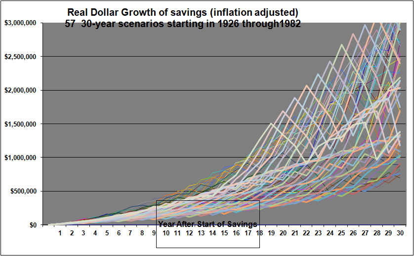
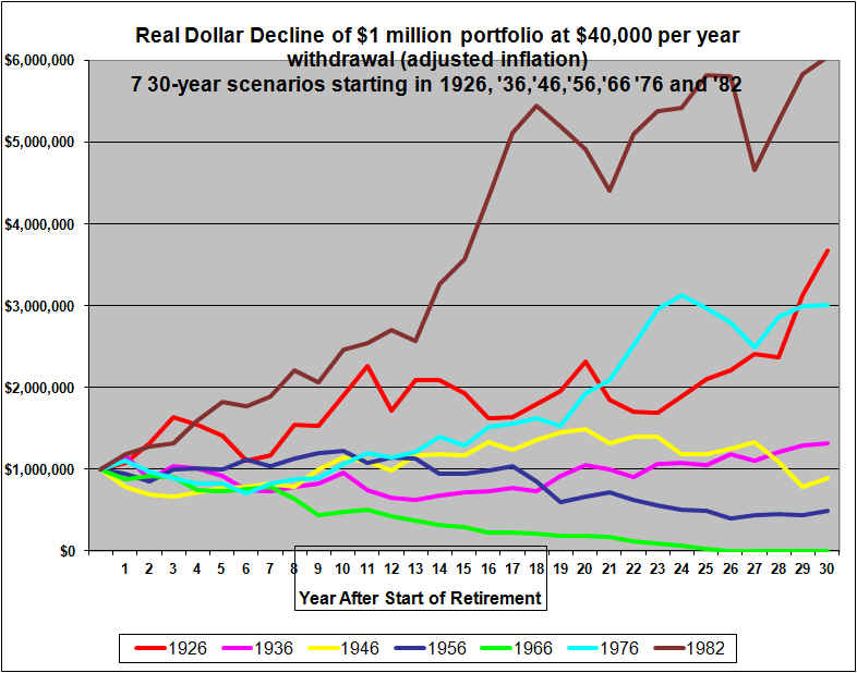
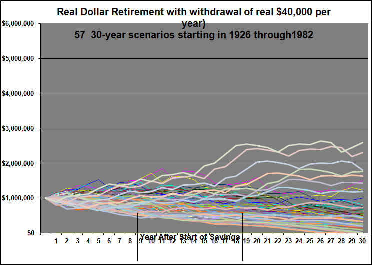
Graph below is 100% Equity Portfolio of $1,000,000 with $40,000 (growing with inflation) withdrawn annually
The above graph is for a very risk-taking retiree who decided to remain 100% in large stock equities for 30-year retirement periods starting 1926, 1936 etc. and who started with $1,000,000 and withdrew $40,000 per year adjusted up for inflation and down for deflation each year to maintain a constant $40,000 worth of purchasing power withdrawn each year.
As is apparent from the table above, the ending results for the different starting years varied across an extremely wide range. The 1966 scenario (the green line) was the lowest and actually ran out of money around year 27. This retiree ran into the poor stock markets of the late 60’s that were volatile but with no upward trend over a period years. There was also a major market crash in 1973, 1974. In addition there was very high inflation through the 70’s with the result that the market needed to return around 10% just to break even after inflation. Around 1982 a huge bull market started, but by then this portfolio had declined to about $250,000 (in real 1966 dollars, adjusted for inflation) and, with the annual $40,000 withdrawals, the bull market could only slow the decline at that point. It’s interesting to note that by about 1968, Warren Buffett was warning that stocks were over-valued and he wound down his investment partnership. The late 60’s was (as Warren Buffett predicted) a very bad time to decide to take a stocks-only 100% equities approach to a retirement portfolio. In fact the late 60’s were a bad time to retire no matter what investment strategy was used because of the crushing inflation of the 70’s.
All but two of the seven the scenarios shown feature huge drops in the portfolio value. The most recent scenario that stated in 1982 (in brown) and ended at the end of 2011 has two huge crashes but fortunately this came only after this portfolio had soared to over $6 million. These huge drops were truly gut-wrenching and horrific declines in the range of 50% of purchasing power. The 1946 retiree (the yellow line) saw exceptional returns for about 20 years, it then ran into weak markets around 1969 and very poor markets in 1973 and 1974, all of this compounded by brutal inflation. Still, even after the brutal decline this retiree still had about $2.9 million left after the decline because the portfolio had earlier built up to well over $4 million. Note that these figures are all adjusted down for inflation.
The retiree who began with $1 million in 1976 (the light blue line) experienced increasingly good returns. By the late 90’s the portfolio appeared to be headed for the moon. But the stock crash of the early 2000’s was quite devastating. Still, this retiree, rather than experiencing a decline in the portfolio over the retirement period, ended up with almost $5 million in the end. Similarly the 1982 retiree (the brown line) experienced a huge portfolio gain and then two crashes in later years but still had over $6 million left at the end of 2011.
Notably, the retiree who began in 1926 (shown in the red line), did very well despite the huge stock crash of 1929 to 1932. This retiree quickly doubled the portfolio to $2 million by the end of 1928. There was then a devastating loss which (even cushioned by deflation) reduced the portfolio back to under $1 million in purchasing power by the end of 1932. But reasonable returns were achieved thereafter and near the end of the period the portfolio sky-rockets to over $5 million with the strong markets of the early to mid 1950’s.
Overall this stocks-only, 100% equity approach to asset allocation did usually result in excellent portfolio growth (rather than the expected decline) over the full 30-year period, but had huge annual volatility and huge differences in the final amount of wealth.
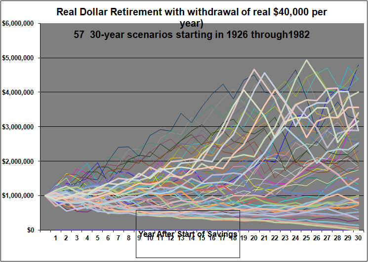
Now, let’s examine the graph for the traditionally Balanced approach to asset allocation in retirement. Note that the balanced approach is fully re-balanced to 60% stocks, 35% long-term corporate bonds and 5% cash at the start of each year. This means that the balanced portfolios benefit from the concept of dollar cost averaging as it buys more stocks at the end of years stocks are down and sells stocks at the end of years they are up.
Graph for Balanced Approach with $40,000 withdrawn annually, growing with inflation, starting with $1,000,000 Portfolio. (60% Stocks, 35% Corporate Bonds, 5% Cash at the start of each year)
This graph uses the same scale as the 100% equity graph, to aid comparability.
As indicated in the table, there is moderately less variability in the ending portfolio values, although ending differences are still very substantial. And it is apparent that the ending values are on average substantially lower. In only the 1966 case (in green) does the portfolio decline in a reasonably smooth textbook fashion to zero or near-zero by the end of 30 years, and in that case unfortunately runs out about five years too early.
In four of the seven cases the portfolio is actually greater than the starting amount after 30 years. And remember this is in inflation-adjusted dollars.
Volatility is reduced but certainly not eliminated. Four of the seven scenarios feature drops that appear to be over 25%.
As detailed in the table above, in six out of the seven cases, the lower volatility of the balanced approach comes at the expense of a large amount of foregone wealth. The sixth case is very similar to the all-equity approach (it runs out of money at year 25, while the 100% equity approach for the same period ran out of money in year 27).
Based on these 7 Scenarios, which is better, all-stocks 100% Equity or the Balanced Approach to Asset Allocation?
Based on these seven historical scenarios, we can see that the Balanced Approach sacrificed, significant amounts of final wealth in return for substantially less annual volatility. The graphs confirm the rule of thumb, that an all equity approach usually outperforms balanced portfolios in the long run, but at the cost of extreme volatility.
It is tempting then to suggest that this evidence argues strongly in favor of a very high allocation to stocks even in retirement.
But the graphs show extreme volatility, in some of the scenarios, with a 100% stocks approach. It’s entirely possible that seeing our $1 million portfolio climb to say $4 million and then plummet to $2 million would drive many of us crazy. Would you want to live the last 10 years of your life knowing that you blew half your savings (estate), amounting to $2 million by your failure to get out of the market at a peak?
In the end, there simply are no easy answers to the asset allocation problem. Each individual will have to choose their own allocation based on their unique circumstances.
The limited evidence above seems to suggest that if you can both AFFORD high volatility AND YOU CAN STOMACH IT, then a very high allocation to stocks/equities might be appropriate even in retirement. This could apply for example where your portfolio is so large that losses in the market will not affect your lifestyle. And, for example, where other pension or other annuity income is enough to maintain an acceptable lifestyle.
Evidence Based on More Data
The above analysis was based on just 7 retirements dates, one per decade starting from from 1926 through 1976, plus the most recently ended 30-year retirement scenario which started in 1982.
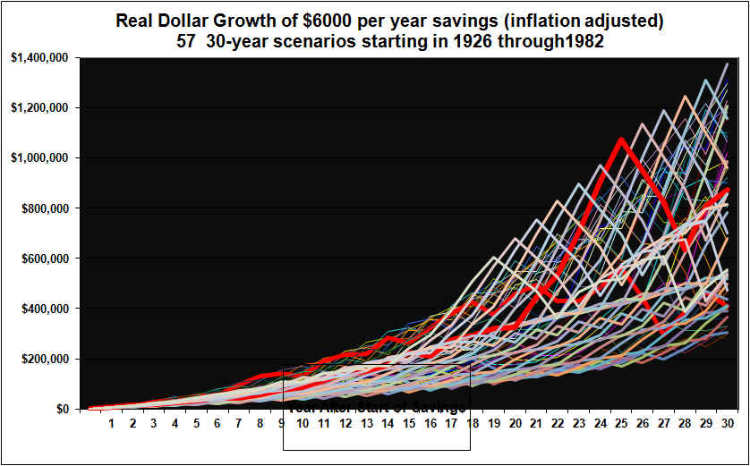
Let’s now graph all the possible 30-year retirement scenarios using each retirement year from 1926 through 1982. The first graph is for the all equity approach.
Graph below is 100% Stocks/Equity Portfolio $40,000 initial withdrawal, growing with inflation
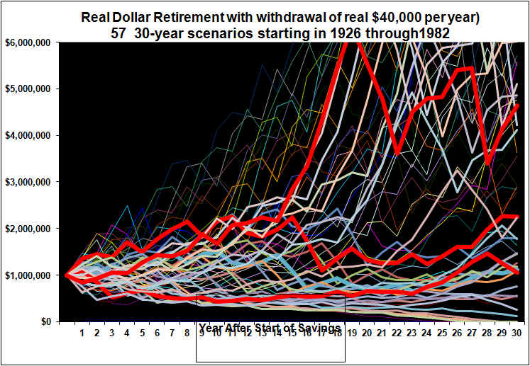
The graph illustrates that with a 4% or $40,000 initial withdrawal, that grows with inflation, from a 100% equity portfolio, in most cases the portfolio grows substantially in retirement. In only 4 cases did the money run out too early (retired in 1929, 1966, 1968 and 1969), and then never before year 24. (Again, remember that the late 60’s was the period that Warren Buffett closed down his equity partnership and indicated that extremely few if any bargains were to be found.) Three lines are high-lighted in dark red to better show the volatility.
The above graph vividly illustrates that what will happen to a 100% equity portfolio over a 30 year period, is highly uncertain. Analysis that focuses on so-called average outcomes such as a steady real 6% gain (which in fact never happens) are highly mis-leading because they do not consider the range of likely outcomes. We could calculate an average line to plot on this graph, but clearly most individual retirement experiences would be far from average.
The majority of these portfolios grow through retirement, with quite a number growing more than five fold. And this is in real dollars, adjusted for inflation.
If you look closely though you can see many huge near-vertical drops. Most of these all stocks 100% equity scenarios see a number of large drops over the 30 years (although most years see gains) and most have one absolutely devastating period (losses in the range of 35 to 50% or more) corresponding to living through the market crashes of 1929 through 1932, 1973 through ’74 (this one exacerbated by huge inflation) of the early 2000’s, and most recently, the crash of 2008.
Given the extreme volatility and extremely uncertain final wealth value illustrated with the 100% equities asset allocation approach, let’s now examine the fully balanced approach.
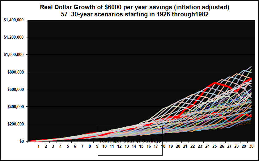
Graph for Balanced Approach to Asset Allocation with $40,000 initial withdrawal, growing with inflation. (60% Stocks, 35% Corporate Bonds, 5% Cash at the start of each year)
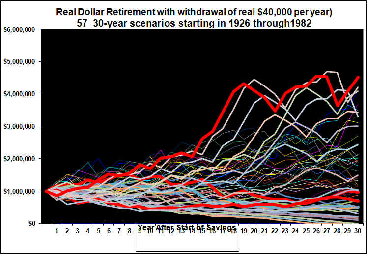
Note that the same scale has been maintained in all four graphs for easier comparability.
The (60% stocks, 35% corporate bonds and 5% cash) Balanced (and re-balanced annually) approach to 30-year retirements that started in 1926 through 1981 delivered a somewhat tighter – but still very wide – range of ending portfolio values and also less annual volatility. In most cases the portfolio would have increased through retirement. In many cases there was still significant volatility but nowhere near as large as for the 100% equity approach. Technically then, the balanced approach has less risk, less uncertainty.
However, this balanced approach ran out of money, just as often, 4 times (retirement in ’65, ’66, ’68 and ’69).
This Balanced Approach only occasionally led to more total wealth over the full 30 years. (The only cases where this 60%/35%/5% Balanced approach did better, regarding ending wealth, was for retiring at the start of ’28,’29, ’30 and ’73). This represents 7% of the 57 cases. The Balanced asset allocation approach provided substantially less annual volatility but at a huge cost in terms of foregone wealth, for the vast majority of the retirement scenarios.
Illustration of the Difference in Ending Values
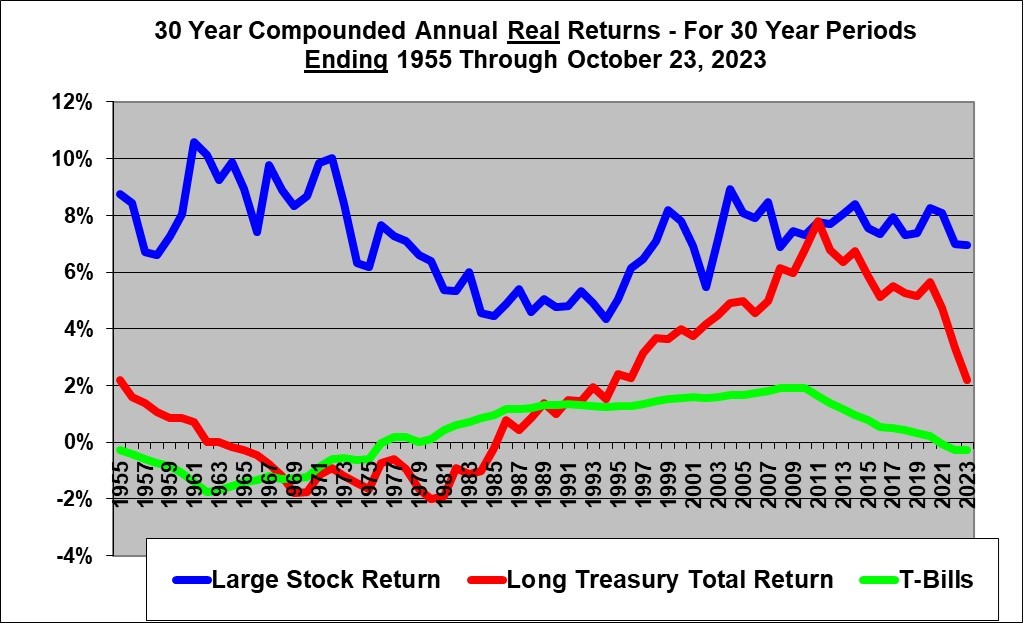
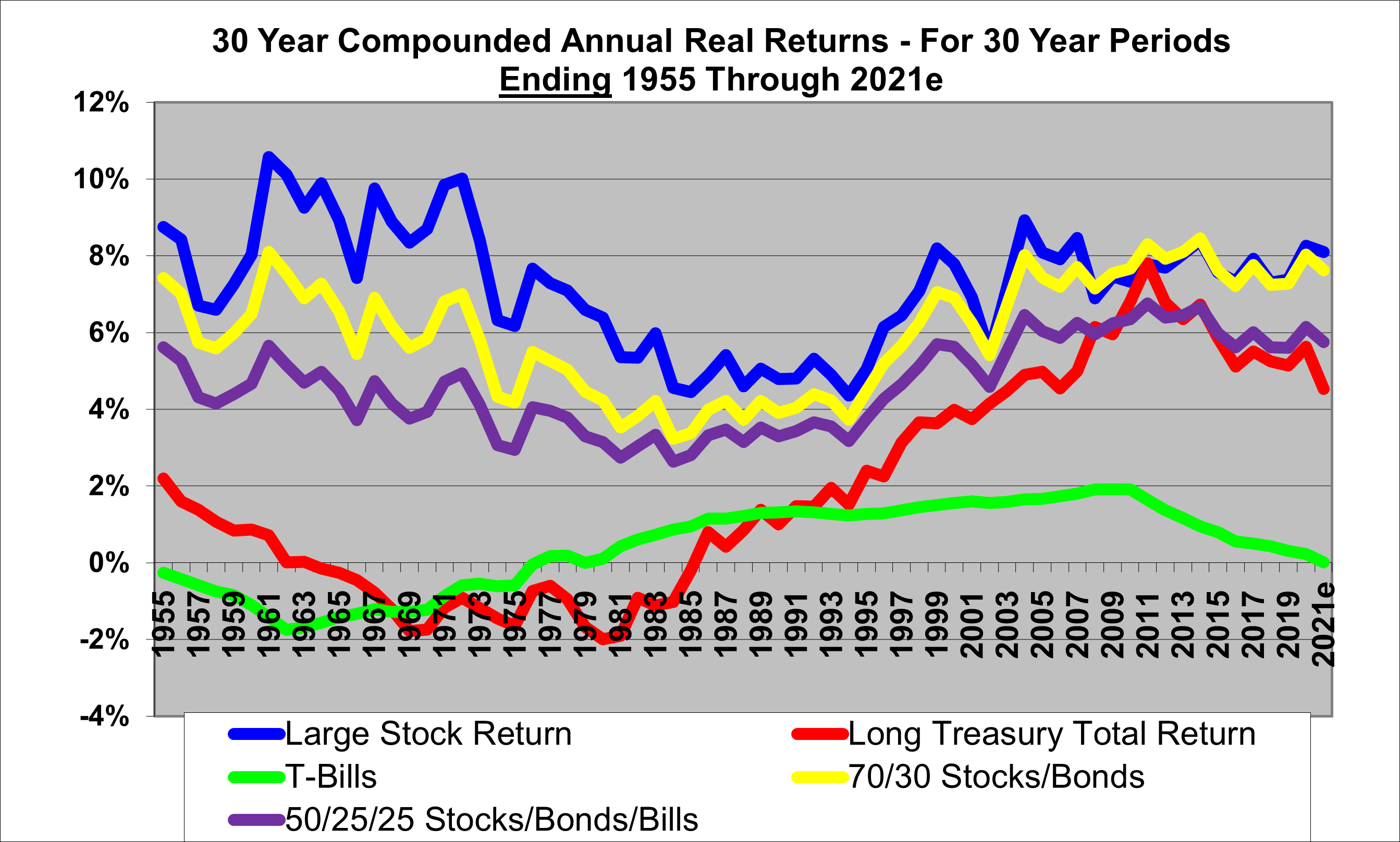
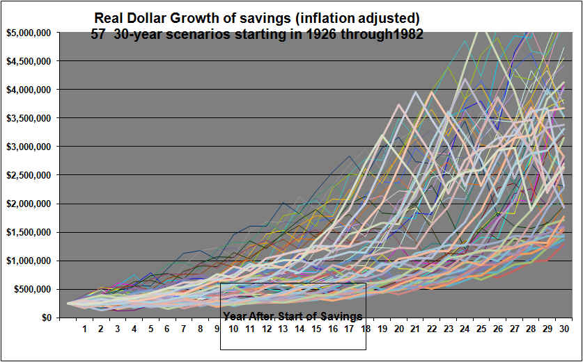
The above graphs show both the volatility along the way and the ending values for the all-equity versus the balanced approach over the 57 different 30-year retirement periods. Again, this is for historical data covering all the possible 30 calendar year retirement periods from 1926 through 1955, all the way to 1982 through 2011.
The following graph displays just the ending wealth values after 30 years for the all-equities versus the balanced approach. This is for starting with $1 million and withdrawing $40k per year adjusted for inflation each year and the ending values are in real dollars adjusted for inflation.
Viewing the data this way, we see that the cases where an all-equity approach vastly out performed the balanced approach in terms of ending wealth values mostly occurred in the 30-year retirement periods that were started back in the 1930′ 40’s or 50’s. For many of the retirement periods started since about 1966, an all equity approach did not out perform the balanced approach by a great margin. (But all-equity approaches started in 1974 to 1978 did).
Observations and Conclusions
The above is the U.S. data for 30 year retirement scenarios starting 1926 trough 1982. I believe my calculations are correct but there is always a chance that I have made an error in calculations and or data entry.
Many books have been written about the proper asset allocation in retirement and about the only universal agreement is that the proper asset allocation is very much dependent on each individual’s unique circumstances including particularly the financial ability to accept risk and the emotional willingness to suffer large losses along the way.
Therefore it is perhaps best if readers draw their own conclusions from the graphs and seek other opinions as well.
However, I will provide my thoughts.
The graphs confirm that the the initial percentage that can be safely withdrawn from a portfolio (where the initial amount is to be fully increased for subsequent inflation), is distressingly low. Even when only 4% was withdrawn (and adjusted for inflation each year), in 7% of the past scenarios the money ran out in the last few years with either an all-equity approach or this 60/35/5 Balanced Portfolio. Higher allocations to bonds or cash, would lead to even more cases of the money running out. This may suggest that if absolute certainty is required then an inflation-adjusted life annuity (purchased from an insurance company) may be the best option.
I believe that the graphs show that it is completely unrealistic to think that a retirement portfolio, with any exposure to inflation, stocks, and/or bonds, can be left on auto-pilot with a withdrawal level that is set at the start and then never adjusted except for inflation. That scenario just does not match what really happens. In real-life, only an inflation-adjusted annuity can be deliver that result. And the annuity approach foregoes a huge potential up-side, and also precludes any of that money being left for an estate.
In real life, the withdrawal rate, and perhaps the asset allocation, will likely be reviewed and changed every few years, depending on many things including, health, life expectancy, financial needs and wants and particularly the portfolio’s performance. All of our working lives we are forced to adjust our spending in accordance with our income. In retirement if our income depends partly on a financial portfolio, then we can expect to adjust our spending in accordance with our investment results. If in retirement your original $1 million grows to $2 million, you are almost certainly going to withdraw more. Conversely, it it sinks to $700,000 after two years, you are going to have to cut back.
A high asset allocation to stocks/equities, even in retirement, appears to offer a good chance for huge rewards but at the cost of huge annual volatility. It may be that by understanding that occasional large losses are simply part of a jagged road to higher wealth, many of us could increase our risk tolerance. Looking at the graphs, the Balanced Approach does not look very appealing, though it would be less stressful.
An all-equity retirement approach started in 2012 might have an advantage because the bond portion of a balanced portfolio is currently offering very low returns.
Other analysts have claimed that the Balanced approach can often be superior, so please check other sources.
Caveats
Again, the above is the U.S. data for 30 year retirement scenarios starting 1926 trough 1982. I believe my calculations are correct but there is always a chance that I have made an error in calculations and or data entry.
The graphs are based on annual year-end data only . Actual daily volatility and distances from peak to trough based on daily data are not shown. For example, the unfortunate scenario of getting 100% into stocks on the highest peak day in 1929, for example, is not shown.
The future is not the past. Even if all-stocks/equities almost always beat balanced approaches over 30 year periods in the past, there can be no assurance that the same will apply in the future. Certainly if one began a retirement with 100% invested in equities at a market bubble peak, the results could be devastating.
The above analysis is based on U.S. data from 1926 onward. This included a golden age of progress but also a depression and several deep recessions. It is possible the future will be far less rosy for equities.
Tax rules might mandate withdrawals significantly larger than assumed in this analysis.
Data for Canada and other Countries may not show the same ultimately favorable (although volatile) picture for equities.
The equity stock allocation here is to the S&P 500 index. Allocations to less diversified or smaller cap equities would have different results.
We have ignored taxes. However in general, taxable accounts would sway the results even more in favor of equities because of the favorable treatment of capital gains historically and of dividends more recently.
We have ignored portfolio management and transaction costs. However, it is not clear that these are materially higher for equities versus bonds and cash. With the 100% equities approach, little trading might be needed if one were tracking an index. In the Balanced approach the annual rebalancing would add to trading costs. Management and trading costs would likely lower the curves in the graphs but not change their shapes much.
The bottom line is that there are no easy answers in investing. Asset allocation in retirement is a highly personal choice. However, the above analysis will hopefully allow the choice to be made from a more educated level.
April 7, 2012 (updating the original article of February 20, 2007) and with some edits Oct 20, 2012
See also our related article about Asset Allocation During the Savings Phase of Life
Shawn Allen, CFA, CMA, MBA , P.Eng.
President
InvestorsFriend Inc.

Additional Graphs
Below is the graph for an allocation equally divided between stocks, bonds and cash
This fully balanced approach above with an equal allocation to each of stocks, corporate bonds and short-term cash investments often produces something close to the textbook smooth decline over the 30 years. However it foregoes the chance for a huge gain in the portfolio that was exhibited in the charts above.
The following is for 75% equities, 25% cash
This allocation of 75% equities, 25% cash is interesting in that based on this past data, the worse scenario has been a smooth decline in the portfolio over the 30 years. However, many scenarios grew. Compared to the 100% stocks approach, it removes apparently much of the risk of running out of money early while retaining much of the up-side of the all-stock approach.
It may be that adding bonds to a portfolio does not reduce risk of running out of money as much as does adding a cash allocation.
Note that all scenarios in this article are based on past data. As we have recently been reminded, there is such a thing as unique circumstances and just like hot and cold temperature records are still being broken, the market in the next 30 years could turn out to be worse than we have ever seen before, or it could be the best scenario ever.
END