The following Graphs illustrate that most years the vast majority of our Buy our Strong Buy rated stocks were up in price.
Click the links to each year to see the names of all the individual stocks, nothing is hidden from you!
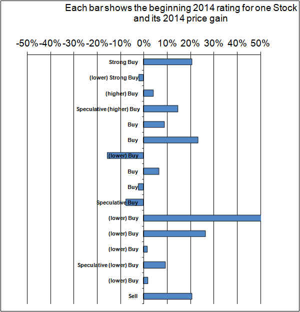
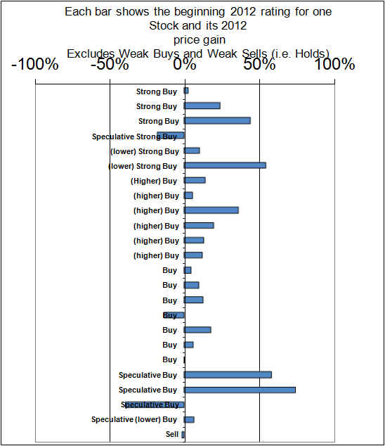
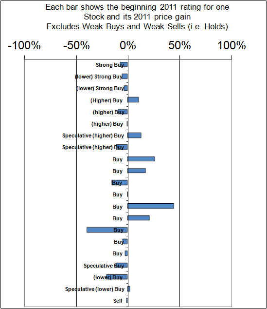
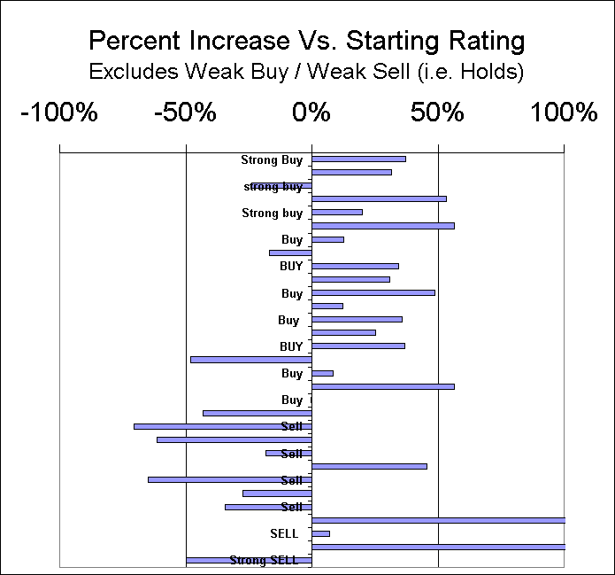
In the following Graphs, each bar represents one Stock. The Stock’s rating as at the start of the year is shown. The bars to the right indicate stocks that are up in price. Bars to the left are stocks that have declined.
Here is the graph for 2014. This was a good year in the markets. We batted 69% correct.
Here is the graph for 2013. This was an exceptionally good year in the markets. We batted 86% correct.
Here is the graph for 2012. It was an excellent year for us and we batted 88% correct.
Here is the graph for 2011. Although we beat the market it was not a great year and only 40% of our stock picks rose in price. Counting one Sell which did fall in price we batted 43% correct overall.
Here is the graph for 2010 which was a good year and 81% of our Buys rose in price. Counting the two Sells which rose in price we batted 74% overall.
Here is the graph for 2009 which was an exceptionally good year for us
Here is the graph for 2008: (We suffered badly in the market crash of 2008)
Graph for 2007, (here we batted only 42% correct, a weak year for us, although the higher-rated stocks generally did well, it was lower rated buys that did badly)
Graph for 2006 (Here we batted 83% correct on the Buys and 76% correct Overall)
Graph for 2005 (Here we batted 83% correct on the Buys and 71% overall)
(Click the link above to see the names of all the individual stocks)
Graph for 2004 (we batted 92% correct on the buys and 86% correct overall)
Graph for 2003 (we batted 86% correct on the buys and 82% correct overall)
Graph for “2002” (we batted 45% correct on the buys and 50% correct overall)
Graph for year “2001” (we batted 69% correct on the buys and 73% correct overall)
Graph for “Year 2000” (we batted 75% correct on the buys and 71% correct overall)
Past performance is no guarantee of future performance nor is it necessarily in any way indicative of future performance.
Measuring performance is somewhat difficult given that a stock originally rated a Strong Buy may later change to a weak buy or even occasionally to a sell.
We have attempted to show performance in the most honest and transparent fashion possible.
Year 2000 performance includes only all those stocks that had an active rating as of January 1, 2000. Year 2000 performance shows the changes in price from the rating that was made closest to but not later than January 1, 2000 through to the rating made closest to but prior to December 31, 2000. (Stocks which were no longer covered were priced through to December 31, 2000. It is fair to use the stock price on the day it was rated rather than using the exact calendar year. So, year 2000 performance is not exactly calendar 2000 but it is reasonably close.
The same process was followed for 2001, the beginning price for 2001 is the ending price used for 2000. Again, for 2002, the beginning price is the ending price from 2001. Beginning in 2002 there are a few U.S. currency stock picks. The performance figures generally exclude the impact of currency (U.S. dollar exchange rate changes) except in the editor’s personal portfolio currency impact is embedded in the results and in the Model Portfolio, the currency impact is included.
For 2003 we reviewed all the Stock Picks at December 31, 2002 to insure that the ratings were still valid and updated any that were not. This insured that for 2003, our analysis year coincides exactly with the calendar year, which was not the case in previous years, as explained above. Similarly for 2004 and each year after that.
Shawn Allen, CFA, CMA, MBA, P. Eng
President
InvestorsFriend Inc.


