
Historical Total Nominal and Real Returns on Stocks (S&P 500 Index)
November 25, 2024.
The S&P 500 has roared higher for the past two years. And there has really only been one particularly bad year since 2008!
Stocks have out-performed bonds and cash-type investments over the long-term. This has been well-proven including in our own article on long-term Asset Class Performance.
But even if stocks have been historically the best investment in the long-term, investors still have to live through the annual and even the daily and hourly losses that come with investing in stocks.
The following graph shows the historical annual returns on U.S. large cap stocks as represented by the S&P 500 Index
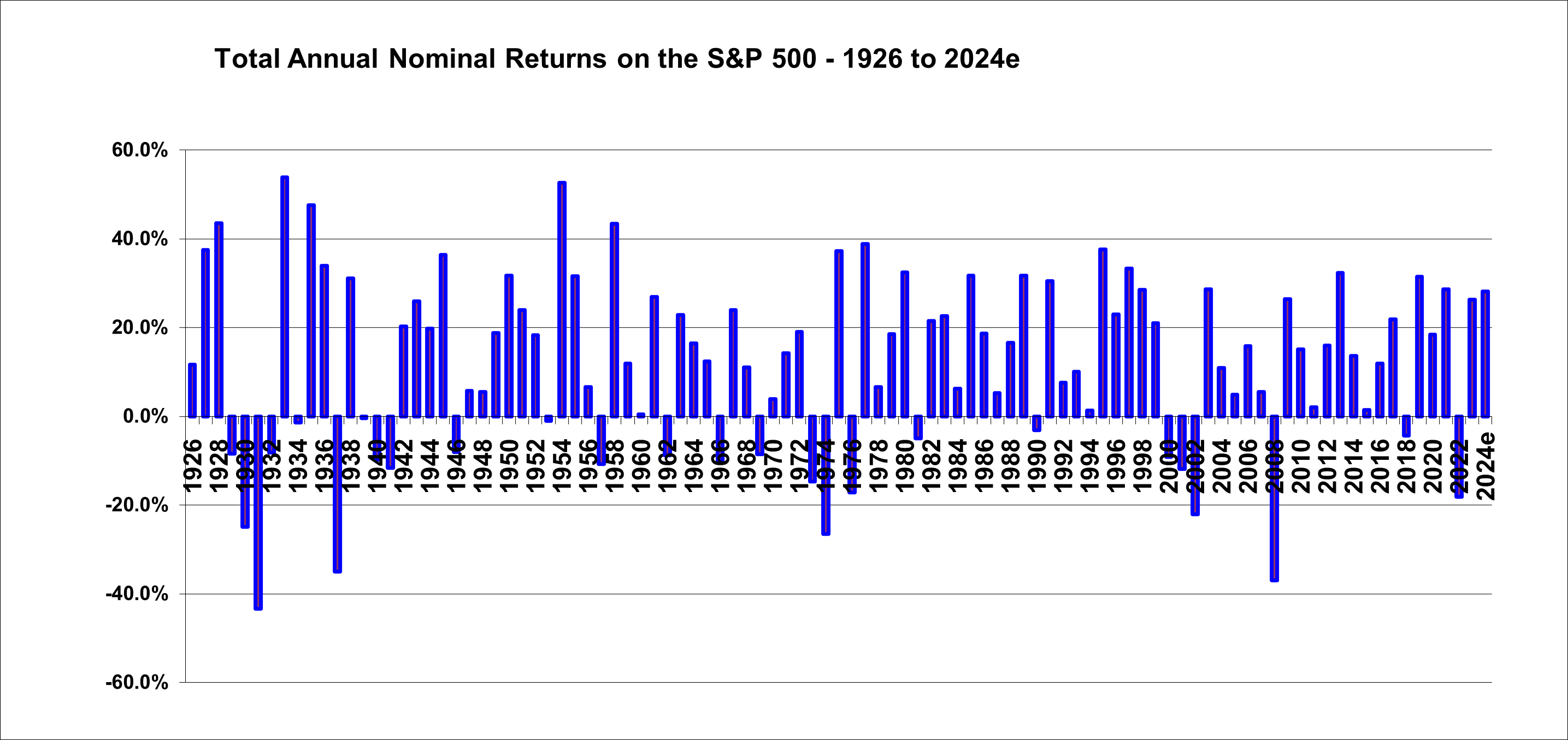
The graph above shows that the total return (capital gain plus dividends) on the S&P 500 index have been positive in the great majority of years since 1926. Despite some huge loss years, the S&P 500 has been a big money maker over the years. However, note that negative returns are worse than they look on the chart because, for example a 30% drop, requires a 43% gain to be reversed. Therefore we need a preponderance of the bar areas to be positive.
The gains and losses shown here are on a calendar year annual basis only. There would be other 12 month periods ending within years that had even larger gains and losses.
The loss in 2008 was the largest single-year loss since the depression years of 1930, ’31 and ’32.
The 16 years from 2009 through 2024 have been extremely strong overall with only 2022 exhibiting a material loss.
The graph shows that periods of significant losses have in the past been followed by strongly positive returns. However, keep in mind that very strong returns are required to “make up for” negative returns. A 67% rise is required to reverse a 40% loss.
The next chart shows the same S&P 500 annual return data but on a real basis where inflation is deducted from each return to provide the percentage gain or loss in purchasing power.

This inflation-adjusted chart shows that the 1973/1974 market crash was even more devastating due to the high inflation at that time.
Overall, these graphs illustrate that buying and holding the S&P 500 has provided strong returns. But it occasionally involves quite devastating pullbacks. The 16 years from 20299 through 2024 have provided very strong returns with only one very bad year (2022). Current S&P 500 investors should be prepared for the fact that large losses do occasionally occur.
November 25, 2024, updating the original article from April 2011
Shawn Allen, CFA, CMA, MBA, P.Eng.
President, InvestorsFriend Inc.