Stocks, Bonds, Bills and Inflation and Gold – Asset Class Performance – updated through October 14, 2023
This article shows you the long-term historic after-inflation performance and returns of the five major asset classes of U.S. stocks, U.S. long-term (20-year) government bonds, U.S. Treasury bills, Gold and cash (the U.S. dollar). The results are truly enlightening and amazing. The results are based on U.S. data from the start of 1926 through October 14, 2023. The data source (other than for Gold) is a well-known reference book called “Stocks, Bonds, Bills and Inflation” 2022 edition. The book is published annually and is available through Wiley. The figures for 2023 were added from other sources as of October 14.
Note that most analysis of historic returns that you have seen is often flawed in that it is based on “nominal” returns before inflation. The graphs and figures below are based on “real” returns after inflation. That is, this analysis shows the real increase in actual purchasing power generated by each investment asset class – and the decrease in the purchasing power of cash.
The first graph below shows the long-term real (after inflation) returns on large capital U.S. stocks (The S&P 500 index of stocks), long term U.S. Treasury bonds (20 years), U.S. Treasury Bills (30-day cash investments), the real value of a U.S. dollar after inflation and Gold. The return is illustrated by showing the inflation-adjusted growth over the years of each $1.00 invested in each asset at the end of 1925.
Note that the investment in 20-year U.S. government bonds does not buy and hold a 20 year bond to its maturity. Rather, it starts with a 20-year bond and sells that bond at the end of each year and reinvests in a new 20 year bond in order to keep the maturity constant at 20 years. In that sense it is a 20-year bond index investment.
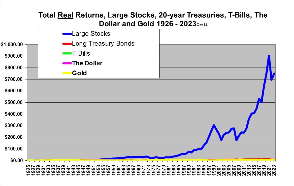
Isn’t that amazing? In real-dollar terms (adjusted for inflation), large U.S. stocks have absolutely clobbered long-term government bonds, short-term cash investments, Gold, and the dollar itself in terms of total growth or return. There is just no comparison! Each dollar invested in large stocks at the end of 1925 was worth $749 in real (inflation-adjusted) purchasing power 98 years later at October 14, 2023. Yes, that is an increase of 749 times the real spending power after inflation!. An astounding gain of 74,800% even after accounting for inflation!
Compared to large stocks, the other asset class values after (almost) 98 years are, comparatively, so low that they barely show up on the graph. (We’ll fix that below.) $1.00 constantly invested in long-term (20-year) U.S. government treasury bonds for those same 98 years was worth $7.03 (after inflation) as of October 14, 2023. $1.00 constantly invested in one month T-Bills since 1926 was worth just $1.33 in real dollars after inflation. $1.00 invested in Gold for the same 98 years was worth $5.35. $1.00 left literally in cash (such as under the proverbial mattress) and not invested at all is now worth what just 5.7 cents bought in 1926, due to the ravages of 98 years of inflation.
Remember, all these figures are after adjusting for inflation (and so the above figures are the growth in real purchasing power) and assume reinvestment of all dividends or interest received and also assume tax-free and no-fee investment accounts. After tax, the growth would be less dramatic but would be even more in favor of stocks versus bonds given the lower tax rates on both capital gains and dividends. However since the Gold held for the 98 years would attract no taxes (unless assumed sold at the end of the period) and no transaction fees, it would improve relative to stocks if income taxes were taken into account.
This means that if your ancestor had foregone just 1 case of beer at the end of 1925 and invested the money, assuming it were possible, in a tax-free account, in the S&P index of large stocks (and reinvested all dividends and rebalanced to stay with the index over the years, and ignoring transaction costs), then you, as heir, as at October 14, 2023, could go out and buy 1 case of beer and still have money enough left to buy 748 more cases! This is truly amazing and is really a case where you can in fact have your cake and eat it too, if you just delay eating the cake and instead invest the money for a long time. Later I will show that there are some pretty good returns over 20 year periods, so you don’t have to actually invest for 98 years! (which is a long time to wait for either a drink or a piece of cake).
This amazing out-performance of stocks (which beat long-term government bonds by a factor of $749/$7.03 or a staggering 107 to 1, in the 98 years) has occurred in spite of the two huge stock crashes that have occurred since the year 2000, not to mention the stock crash of the great depression. The S&P 500 stocks also clobbered Gold by a factor of $749/$5.35 or a withering 140 to 1.
The continuous investment in one-month T-Bills at $1.33 has just barely kept ahead of inflation. And a dollar kept literally in cash as in a safe deposit box or under a mattress still is the same dollar but it now buys only what 5.7 cents would have bought in 1926. Cash in a safe deposit box is a wasting asset, over longer periods of time, in the presence of inflation.
The above graph which has a normal linear (arithmetic) scale does a great job of showing the huge difference in the ending portfolio values but unfortunately is horribly distorted in four ways. First, the results from the earlier years are not really visible. Second, it looks like the percentage rate of growth for stocks was increasing toward infinity until 1999 and also again from about 2011 to 2021. Third, on this graph it looks like the early 2000’s stock crash and the 2022 decline were the biggest market crashes ever – which they were not. Fourth, the very strong performance of government bonds and Gold in some recent years is obscured and is not even visible.
A logarithmic scale solves these problems because a constant percentage growth appears as approximately a straight line and the percentage gains in the earlier years are much more visible. Also the large gains in Gold and long-term government bonds in more recent years will become visible. Unfortunately a logarithmic scale tends to somewhat obscure the huge differences in the ending values. When viewing a growing data series it is essential to to view it with a logarithmic scale in order to properly understand the trend and the volatility over time. A regular linear arithmetic scale is useful for showing the total growth achieved in the end but horribly distorts the trend and the level of volatility across time. The longer the time period and the higher the average annual percentage growth, the worse the distortion.
The same data presented in the above graph is presented below with a logarithmic scale.
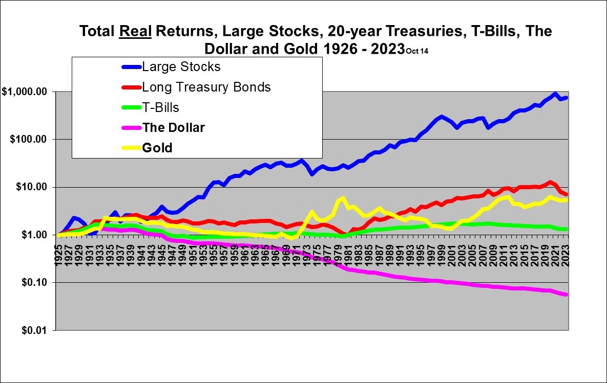
In this graph (with the same data as above) you now have to look more closely to realize the amazing extent to which large stocks (the S&P 500) outperformed Treasury bonds, T-bills, Gold and the dollar itself over the (almost) 98 year period. But only this logarithmic scale allows you to properly view the trend and volatility over the years.
A constant slope on this logarithmic graph represents an approximately constant annual percentage growth. By the nature of logarithmic graphs, a dip or gain on this graph of a certain height represents the same percentage change whether it happened in the 1920’s or the 2000’s. Any dip or gain visible on this graph is actually large since a logarithmic scale tends to make even large percentage changes look small.
This graph reveals that large cap stocks (the blue line) were much more volatile than bonds, particularly from 1926 – 1932, the mid 70’s and in the first decade of the 2000’s. Again, remember that the graphs show real returns, adjusted for inflation. It is interesting that the big stock market crash in 1987 is not apparent on this graph. The reason for that is the fact that the graph here shows only year-end figures. The big crash in 1987 was actually an event that happened within the year as stocks soared until October that year and then crashed. On a calendar year basis U.S. large cap stocks were actually up slightly in 1987. Similarly, the pandemic panic of Spring 2020 is not visible since it was largely recovered from by the end of that year.
The Graphs below take the data above and break it out into 20 year periods and reveal some very interesting insights into asset performance in different periods. Note that the scales below are linear (as opposed to logarithmic) and that all the scales go to $8.00 (A 700% gain, from the $1.00 starting point). A linear scale is acceptable here given the relatively short time period. By using the same scale it is easier to visually compare the performance across the different 20 year periods.
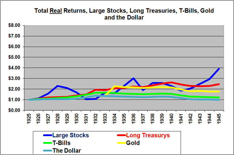
Long Treasury Bonds (the red line) look like the place to be in the 1926 – 1945 period. Stocks beat out Bonds in the end but it was a rough ride indeed. The stock index returned 291% after inflation in the 20 year period while the Treasury bond index returned 148% and Treasury bills eked out 22%. Gold gained 78% in real terms. The gain in Gold was due to a U.S. devaluation of the dollar from 1/20th of an ounce of Gold to 1/35th of an ounce of Gold in 1934. A paper dollar in a safe or under a mattress gained in value during the depression due to deflation and ended up losing just 1.5% in purchasing power over these 20 years. (And that was despite the devaluation of the U.S. dollar in terms of Gold which apparently had no impact on inflation inside the United States).
Notice that the dollar exactly tracked Gold (or was it vice versa?) until 1934 which was when the U.S. government forced citizens to turn in their Gold for $20.67 per ounce (so called expropriation, but they did pay for the Gold, but the former Gold holders lost out on the appreciation in Gold that came soon after it was “expropriated” and then the government effectively devalued the dollar by redeeming U.S. $35.00 dollars from foreign banks in exchange for one ounce of Gold as opposed to the former $20.67. ($1000 therefore that used to “buy” 48.4 ounces of Gold would then buy only 28.6 ounces due to the devaluation of the U.S. dollar in terms of Gold). The value of a dollar fell sharply relative to Gold in 1934 but then precisely parallels gold for the remainder the period shown in this graph.
The (relatively) unique thing about this time period was the huge stock valuation bubble in the late 20’s followed by a bursting in late 1929, which was then exacerbated by poor government policies that led to the Great Depression. Note that the full extent of the stock bubble and devastating crash is not visible in this graph because it uses only year-end, rather than daily data.
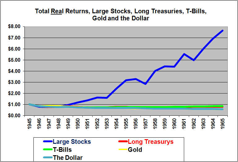
Wow, 1946 – 1965, what an incredible run for stocks!, while bonds and T-Bills and Gold all failed to even keep up with inflation. The dollar itself fell in real value due to inflation. It’s interesting to note that stocks would be considered to be much more risky, because they increased in a volatile fashion while bonds were pretty flat and went nowhere. But if this is what people call risk, I’ll take it! The stock index returned a whopping 664%, after inflation, while the long bond index investment lost about 21% and even so-called risk-free Treasury bills lost 16% after inflation, over the 20 years. Gold lost 46% in real terms and the dollar itself lost a similar 43%. Gold was tied to the dollar because the U.S. government would (for foreign governments) redeem dollars for Gold at a fixed $35 per ounce, hence the similar loss.
Whenever you look at long term data that shows the huge margin by which stocks have beaten bonds, it is wise to remember that a huge chunk of that came from the 16 years after 1948.
During this period there was moderate inflation, in contrast to the deflationary 1930’s. Long-term bond rates did not appear to reflect an expectation of even moderate inflation. Stocks were able to keep up with inflation, (in fact far out-paced inflation) while long term bonds got hammered due to unanticipated inflation. The post war years also saw unprecedented gains in productivity and the birth of the consumer society. This benefited stocks, hugely.
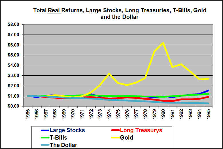
The 1966 to 1985 period included an incredible run for Gold from 1972 to 1980. But, ouch!, this was an ugly time to be an investor in stocks and bonds. Note that the scale extends to $8.00 so that the graph can be easily and properly compared to the 1946-1965 graph above. These were the really big inflation years and both stocks and bonds as well as treasury bills had a very hard time keeping up with high inflation. The dollar itself lost an ugly 71% in real purchasing power mostly due to the famously high inflation of the 1970s. It does not look like much, but stocks returned a total real portfolio gain of 53% over the 20 years while long bonds lost 7% and Treasury bills made 20%. Both stocks and bonds were volatile and both had periods where they dropped about 50%. T-bills were looking good with low volatility and reasonable returns compared to the other assets.
But Gold, was the place to be. It continued to track the dollar until President Nixon took the dollar off of the Gold standard in 1971 and then Gold soared in dollar terms. From 1972 to 1980, Gold did a LOT more than keep up with inflation. At its peak it had risen about 500% in real buying power terms even after adjusting for the big inflation.
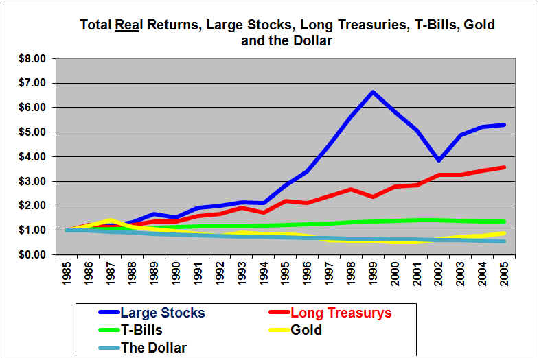
Next we look at the period from the end of 1985 through the end of 2005.
$1.00 invested in large stocks at the end of 1985 was worth $5.29 at the end of 2005 for a gain of 429% in real after-inflation terms. This was in spite of the stock crash of the early 2000’s. The gain in stocks from 1985 to 1999 was similar to the gains from 1948 to 1965. The 20-year investment of $1.00 in long-term bonds grew to $3.15 (215% gain) and for T-Bills grew to $1.36 (36% gain). Gold did not quite hold its purchasing power and was down 13% in these 20 years. $1.00 invested in gold at the start of 1986 had fallen to an inflation-adjusted 54 cents at the end of 2000 but then roared back to 87 cents at the end of 2005. The purchasing power of a cash dollar fell by 44%.
A very distinctive thing about the period of 1986 through 2005 was a huge drop in interest rates. This provided a huge boost to bond returns. It also contributed to higher P/E multiples being justified for stocks, which boosted stock returns. Another relatively unique thing about that period was the huge stock valuation bubble of the late 90’s which then deflated and then partially recovered.
In order to cover the 20 years ended in 2023, our next graph will over-lap the last two years of the one above.
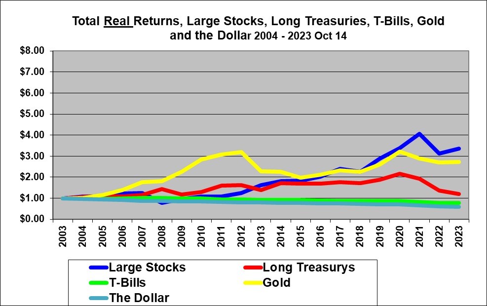
In the 20 years from the end of 2003 / start of the year 2004 through October 14, 2023, Gold initially clobbered stocks but in the end stocks prevailed. 20-year Treasury Bonds had done very well over this period until they got clobbered with the higher interest rates and inflation in 2022.
$1.00 invested in large stocks (the S&P 500 index) for the 20 years since the start of 2004 (end of 2003) was worth $3.37, (a 237% gain) in real terms after inflation, as of October 14, 2023. For an investment constantly rolled over each year in 20-year long-term government bonds the figure was $1.19 and for monthly Treasury bills $0.78. Gold surged from 2004 to 2012 and $1.00 invested in gold peaked at $3.20 and ended the 20 year period at $2.73. The purchasing power of a cash dollar declined 41% in these 20 years to 59 cents due to inflation.
A distinctive thing about the period of 2004 through 2021 was a huge drop in interest rates until the end of 2021. This provided a huge boost to bond returns. It also contributed to higher P/E multiples being justified for stocks, which boosted stock returns. This period included crisis of 2007 / 2008 which was followed by huge gains in stocks after 2009. This period also saw the emergence of the digital economy and the huge valuations of certain companies in that sector. The last two years of this period included a huge increase in interest rates which pushed stock values lowered and really hammered the value of long-term government bonds.
The above graphs demonstrate that the market looks very different in different time periods and it is therefore very dangerous to make assumptions about the relative performance of stocks and bonds in the next 20 years.
Conclusions and Summary
By studying these graphs, you can draw your own conclusions about the relative past returns and risks of Stocks, Bonds, T-Bills and Gold. And you can see the decline in purchasing power that occurs with actual cash held in a safe or in a mattress for 20 year periods.
Note that these total return indexes ignore taxes (effectively assumes a non-taxable account) and also ignore trading costs.
Stocks (the S&P 500) out-performed 20-year government Bonds and T-bills and Gold by an absolutely staggering amount over the last 98 years. Stocks therefore also did a far superior job of protecting against inflation over the full 98 year period.
Stocks even out-performed over the 20 years from 1926 through 1945, in spite of the depression and crash of 1929-1932. Bonds also did reasonably well. T-Bills were basically the after inflation equivalent of stuffing cash under the mattress. Gold did reasonably well over the full 96 year period but was highly volatile in terms of purchasing power. Actual cash in a mattress basically rotted away due to high inflation in some decades.
For the 20 years from 1946 to 1965, stocks were far superior. Long-term bonds and T-Bills imitated mattresses (but did protect against inflation, although not fully). The dollar itself and Gold which was tied to the dollar both lost almost half of their purchasing power.
The 20 years from 1966 through 1985 were ugly all around (unless one held Gold). Stocks came out slightly ahead of bonds. Gold had very large returns as it was de-coupled from the U.S. dollar and as Americans were again allowed to own it.
During the 20 years ended 2005, Stocks did very well but with high volatility, Bonds did unusually well compared to stocks and with a lot less volatility. T-Bills continued to only slightly out-perform inflation. Gold slightly trailed inflation.
In the 20 years ended 2023 (based on October 14 2023 data) stocks did very well and Gold was also strong while long-term government bonds did very well until they declined noticeably in the last two years of this period.
A major learning from the above graphs is that the markets look very different in different time periods. It would be foolish indeed to base your investment decisions solely on the results from the last 20 years or so. Those two decades were unique due to a combination of lower inflation and dramatically declining interest rates (until recently) as well as the maturing of the digital economy.
The above data and graphs focus on just five 20-year investment periods beginning at the end of 1925, 1945, 1965, 1985, and 2003. Given the significant differences in the performance of stocks, versus bonds or T-bills and Gold over those different periods, it is also very useful to look at the comparison over all the possible 10 to 30 year holding periods beginning each year since the end of 1925. My related article does this by graphing the average annual returns over all those possible holding periods and also attempts to answer the question of whether stocks are really riskier than bonds.
Originally written Summer 2001 and updated annually and last updated October 14, 2023
Shawn Allen, CFA, CMA, MBA, P.Eng.
President, InvestorsFriend Inc.