April 7, 2012
Imagine that you have an income and that you want to save and invest money each year for thirty years and that you hope to become significantly wealthy through this investment program, perhaps to fund a very comfortable retirement.
Should you invest the money in a balanced fashion in stocks, (long term) bonds and short-term cash? Or should you invest all the money in stocks? This is known as the asset allocation decision.
Virtually the entire investment community will advise you to take a balanced approach to asset allocation holding both stocks and bonds and possibly some cash as well. For example a model allocation for a pension plan is 60% stocks and 35% bonds and 5% cash.
The future will surely be different from the past. Still, when contemplating a 100% stocks approach, versus a balanced approach, it seems wise to ask: How would this have worked out if it was tried in the past?
This article looks at the results that would have been achieved over all the possible 30-calendar year investing periods starting from 1926 through 1955 and ending with 1982 through 2011. The annual returns and volatility of both balanced and 100% equity approaches are studied.
In the analysis we will use a typical balanced approach of 60% stocks, 35% long-term corporate bonds and 5% “cash” (i.e. 90-day government treasury bills).
The data suggests that you might want to consider ignoring conventional advice and keep all of your investments in stocks rather than using a balanced approach to your asset allocation decision.
Results from Actual Data
Using Actual U.S. data for past calendar year returns from Stocks, Bonds, and Treasury Bills going back to 1926, this article presents some rather startling conclusions about the actual returns and volatilities that have been experienced in the past over 30 calendar-year savings periods. This data is from a publication called Stocks, Bonds, Bills and Inflation which is published annually by Ibbotson Associates, now a division of Morningstar. Actual returns and volatilities over various historic 30-year periods have varied over an enormously wide range.
Past savers were impacted to an extremely large degree by the “luck-of-the-draw”, in terms of how the markets did over their particular saving years. For example an all-equity savings program started at the beginning of 1944 accumulated an amazing 68% more than a similar savings program started just one year later.
This article presents data that suggest that a 100% allocation to equities has historically worked out very well, beating the balanced approach by a wide margin, by the end of the great majority of the historical 30-year saving periods – using data that begins in 1926. The only exceptions were for four most recent for 30-year periods, the ones started in 1979 thru 1982 and which ended in 2008 thru 2011 where the balanced portfolio was the winner. However the 100% equity approach features some truly ugly volatility along the way. Also in the period 1981 – 2010, the 100% equity approach won only by a hair.
Portfolio growth scenarios are often worked out using assumed average returns that are expected to be achieved. The return assumptions have tended to range from 6% to 10% per year. (Although lower assumptions have recently become more popular as a result of the market crash of 2008 /2009). Usually, it is assumed that an annual contribution is made (such as to a tax-deferred retirement savings account) and that the portfolio of money is invested in a balanced manner, between stocks, corporate bonds and short-term cash deposits.
A huge flaw in many studies is that they work with nominal (not adjusted for inflation) figures rather than real (constant purchasing power) inflation-adjusted figures. Most models may also be highly unrealistic in that they assume some constant return level each year. The reality is that returns vary enormously from year-to-year. Returns also vary enormously over different 30-year periods.
This article is based strictly on real inflation-adjusted returns and volatility. We assumed a savings level of $500 per month or $6000 per year for 30 years. This is in real dollars, so in nominal dollars, an initial $500 per month savings would be adjusted up or down each year for inflation or deflation.
For these scenarios we will assume there is no tax paid until withdrawal, so this is a tax-sheltered retirement savings account.
The question is, what happened, based on this past data? How much money (in real dollars) was accumulated over various 30-year savings periods?
When we applied this scenario to someone who retired in each of 1926, 1936, 1946, 1956, 1966, 1976 and (to capture the period ended in 2010) 1981, using actual historical return data, the results were quite startling.
We compared two asset allocation approaches. One approach was to notionally invest the portfolio in 100% equities as represented by the S&P large stock index in the U.S. The other approach notionally invested the funds in a traditional typical balanced manner with 60% the S&P large stock index, 35% U.S. Corporate Bonds and 5% Cash, and rebalanced each year. Our data was taken from the annual yearbook, Stocks, Bonds, Bills, and Inflation, by Ibbotson Associates. Their figures show real total returns (inflation adjusted and including dividends and re-investment of dividends). These figures ignore any transaction and money management fees.
We used $500 per month ($6,000 per year) as a round figure and as an amount that is perhaps within the reach of most two-income families. This was equivalent to about $50 per month in 1926 but the same math applies.
First, let’s look at how much money was accumulated after 30 years, using both a 100% equity strategy and a fully balanced approach to asset allocation.
| Save $6,000 per Year for 30 Years | ||||
| Analysis is in Real Inflation-Adjusted Dollars | ||||
| Ending Balance 30 Years Later | ||||
| Start | End | 100% Equities | Balanced | Balanced is lower by |
| 1926 | 1955 | 1,022,308 | 582,478 | 43% |
| 1936 | 1965 | 1,295,297 | 596,178 | 54% |
| 1946 | 1975 | 470,812 | 307,427 | 35% |
| 1956 | 1985 | 364,055 | 311,983 | 14% |
| 1966 | 1995 | 677,539 | 559,552 | 17% |
| 1976 | 2005 | 813,905 | 688,211 | 15% |
| 1982 | 2011 | 506,360 | 534,310 | higher by 6% |
The Table shows what would have happened if we started, in each of the years shown, and saved $6000 per year for 30 years and fully adjusted the $6,000 for inflation each year. If the portfolio was 100% invested in large stocks (The S&P 500 index and its predecessor), then in all except the last case, this 100% equity approach significantly out-performed a balanced portfolio. But the balanced approach beat the 100% equity approach in the 30 years ended December 31, 2011.
A 100% equity allocation, especially as retirement approaches is generally considered very risky, because of annual volatility and because of high uncertainty in the returns. The usual advice is to move to a balanced portfolio. This is expected to offer a somewhat lower return, but with significantly less volatility.
And, looking at the Fully Balanced Portfolio, in the table above, it certainly did deliver less return in six of the seven cases.
Looking at the table above, it is not at all obvious that the Balanced Approach to asset allocation is preferred. But this is based on only seven cases. (However, the seven cases are 30 year savings periods that start in six different decades so they may be reasonably representative of a range of possibilities). And the table does not show the volatility experienced over the years. Below we will provide graphs for all 57 possible 30-year savings period scenarios from 1926 through 1955, all the way to 1982-2011.
But first, let’s take a graphical look at just the seven retirement scenarios presented in the table above.
Graphs allow us to see the annual volatility through the years.
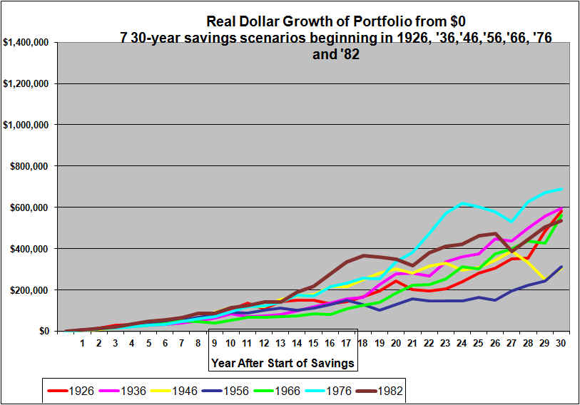
Graph below is a 100% Equity Portfolio $6000 per year saved in real dollars

The above graph is for risk-taking savers who decided to remain 100% in large stock equities for 30-year savings periods starting in 1926, 1936 etc and the most recent 30-year period starting with 1982 and who saved $6,000 per year adjusted annually up for inflation and down for deflation to maintain a constant $6000 worth of purchasing power, in dollars of the starting year, saved each year.
As was apparent from the table above, the results for the different starting years varied across an extremely wide range. The ending amounts (in real dollars, adjusted for inflation) varied from $364,000 to $1.3 million. The variance is explained simply by the luck-of-the-draw in terms of how the markets did.
Each of the seven lines had years of relatively steep drops. The drops in the early years look small in comparison to drops in later years even though the percentages may have been similar. However, a 30% drop in year 4 of a savings program is very minor compared to a 30% drop in year 28. A 30% drop in the early years would not represent a large amount compared to a person’s salary. The 30% drop in the early years may even be advantageous since the future annual contributions would be made at lower market prices. By the last few years the annual contribution is a drop-in-the-bucket compared to the portfolio and so at that point market dips have no silver lining.
Perhaps surprisingly, the 1926 savings scenario (in red) turned out to be a very good one. This saver suffered through the horrific market crash of 1929 through 1932 but, they only had a small amount invested at that point and the loss was far outweighed by gains in later years. The 1946 through 1975 scenario (in yellow) suffered horribly in its last few years as it ran into the crash of ’73, ’74 and also suffered greatly from the high inflation of the 70’s. The 1976 through 2005 scenario (in light blue) ended up at a high value but was well down from its peak in 2000. The latest scenario 1982 through the end of 2011 (in brown) peaked back at the end of 1999 and then suffered two horrible crashes ending below its peak value in spite of 12 years of additional savings.
A notable feature, of the above graph is that all seven savings scenarios featured significant volatility (in three cases there were extremely large drops in the later years). And this is based on annual data. The actual distance from peak to trough would be noticeably greater with daily data.
Now, let’s examine the graph for the Fully Balanced approach to asset allocation. Note that the balanced approach is re-balanced to 60% stocks, 35% corporate bonds and 5% short-term cash at the start of each year. (It is often claimed that the dollar-cost-averaging associated with rebalancing will bring tremendous benefits.)
Graph for Balanced (and annually re-balanced) Approach to Asset Allocation with $6000 per year saved in real dollars
This graph uses the same scale as the 100% equity graph, to aid comparability.
As indicated in the table there is far less variability in the ending values, although there is still quite a range.
As expected, these scenarios climb much more steadily but also generally much more slowly. There are still some very notable drops which correspond to crashes in ’73, ’74.,the crash of the early 2000’s and the crash of 2008 is quite visible in the 1982 scenario (in brown)
Based on these 7 Scenarios, which is better 100% Equity or the Balanced Approach?
With the benefit of hindsight, we can see that the Balanced Approach to asset allocation, in six of the seven cases, sacrificed, a significant amount of wealth in return for substantially less annual volatility. However in the most recent 30-year scenario, the balanced approach provided six percent greater wealth as well as lower volatility. The graphs confirm the rule of thumb, that an all-equity approach usually outperforms balanced portfolios in the long run, but at the cost of extreme volatility.
It is tempting then to suggest that this evidence argues in favor of a very high allocation to equities throughout the savings phase of life.
But the graphs show high (and in some cases extreme) volatility with a 100% equity approach. And in one of the seven cases shown, the “reward” for 30 years of higher volatility was 6 percent lower wealth. It’s entirely possible that with a 100% equity approach, seeing our portfolio lose perhaps more than we are making in salary in a single year would drive many of us crazy. We might feel awfully dumb for not having moved partially out of equities at market peaks.
Evidence Based on More Data
The above analysis was based on just 7 saving “life times”, starting one per decade from 1926 through 1976, plus 1982.
Let’s now graph all the possible 30-year calendar year saving scenarios using each starting dates from 1926 through 1982. The first graph is for the all-equity approach.
Graph below is 100% Equity Portfolio $6000 per year saved in real dollars
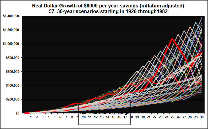
The above graph is for risk-taking savers who decided to remain 100% in large stock equities for a full 30-year savings period. The graph shows what would have happened for all possible 30-year savings periods starting with1926 through 1955,then 1927 through 1956 all the way to 1982 through 2011. Each scenario is for $6,000 saved and invested per year adjusted annually up for inflation and down for deflation to maintain a constant $6000 worth of purchasing power saved annually. Two lines are high lighted in dark red just to better illustrate the volatility.
The savings amount was $6000 per year adjusted up or down for inflation / deflation. There is quite a range in the ending portfolio values, all the way from $277,000 (1952-1981) to $1.4 million (1970-1999). One thing that the graph illustrates is that there is really no such thing as a “typical” ending value. The average ending value is actually $755,000. But that is a pretty useless figure. What good is it to know that the average was $755,000, when in reality in one case the ending portfolio was only $277,000?
The above graph vividly illustrates that what has happened to a 100% equity portfolio over a 30 year period, is highly volatile. Analysis that focuses on so-called average outcomes such as a steady real 6% gain (which in fact never happens) are highly mis-leading because they do not consider the range of likely outcomes.
If you look closely at the individual lines, each of which represents the progress of a portfolio over 30 years, you can see many huge near-vertical drops. Most of these 100% equity scenarios see a number of large drops over the 30 years (although most years see gains) and most have one absolutely devastating period corresponding to living through the market crashes of 1929 through 1932, 1973 through ’74 or the early 2000’s. The most recent case 1982 to 2011 suffers two devastation periods, the early 2000’s plus 2008.
Given the extreme volatility illustrated, lets examine the balanced approach. Conventional investment advice argues that a balanced approach is preferred in order to smooth volatility.
Graph for Balanced and annually re-balanced Approach with $6000 per year saved in real dollars
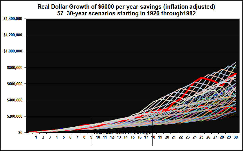
Note that the same scale has been maintained in all four graphs for easier comparability.
The Balanced asset allocation approach to 30-year savings periods started in each year from 1926 through 1982 delivered a much tighter (but still not exactly tight) range of ending portfolio values. The range is from $202,000 to $860,000, with an average of $495,000. Technically then, the balanced approach has less risk, because the outcome is not subject to as much uncertainty. Two lines are high lighted in dark red just to better illustrate the volatility.
However, the balanced approach in all but four of these 57 real data cases, delivered a lower ending portfolio value. The four times where the balanced approach ended with a higher value were the most recent cases, ended 2008 through 2011, the 30-year savings scenario started at the beginning of 1979 through 1982. In many cases the 100% equity approach delivered two times more wealth by the end of 30 years. The biggest out performance was for the brave investors who started during the 1930’s at the end of the great crash and used a 100% equity approach.
Given that stocks have usually out-performed, balanced scenarios that feature even lower amounts of stock and higher amounts of cash have under-performed much more dramatically. Portfolios that are equally divided between stocks, corporate bonds and cash and rebalanced annually have under-performed a 100% equity approach in all 30 calendar year savings scenarios going back to 1926, based on this U.S. data.
The Balanced approach (60% stocks, 35% corporate bonds and 5% cash and rebalanced annually) provided substantially less annual volatility but at a large cost in terms of foregone wealth, for the vast majority of the scenarios (and there was some foregone wealth in all but two scenarios).
Illustration of the Difference in Ending Values
The above graphs show both the volatility along the way and the ending values for the all-equity versus the balanced approach over the 57 different 30-year periods. Again, this is for historical data covering all the possible 30 calendar year periods from 1926 through 1955, all the way to 1982 through 2011.
The following graph displays just the ending wealth values after 30 years for equities versus the balanced approach.

This graph shows that the all-equities ending portfolio value was vastly higher than the balanced approach for 30-year saving periods that started in all the years from 1926 to 1944. This was presumably due to low stock prices that prevailed after 1929. Savings efforts that were started in 1926 to 1929 were ultimately not that much impacted by the 1929 stock crash because these portfolios are for $6000 per year and a large crash at the outset was offset by all the money invested in all the years after 1929. For 30 year saving periods that started in years after 1944, the all equities approach almost always has the higher ending value but in most cases it is not that much higher. For the 30-year periods started in 1969 to 1972, stocks once again vastly outperformed. This was partly due to low stock prices prevailing in the 1970’s. All equity approaches to 30-year savings periods started in 1979 through 1982 did not beat the balanced approach partly because bonds offered high returns for much of that period and because stocks had poor returns in the 2000’s.
Observations and Conclusions
The above is the U.S. data for 30 year retirement scenarios starting 1926 trough 1982. I believe my calculations are correct but there is always a chance that I have made an error in calculations and or data entry.
Many books have been written about the proper asset allocation to use for a savings program and about the only universal agreement is that the proper asset allocation is very much dependent on each individual’s unique circumstances including particularly the financial ability to accept risk and the emotional willingness to suffer large losses along the way.
Therefore it is perhaps best if readers draw their own conclusions from the graphs and seek other opinions as well.
However, I will provide my thoughts (why stop now?)
The evidence seems clear, a 100% equity approach to asset allocation very likely out-perform a balanced approach over a savings lifetime. But the 100% equity approach will probably feature at least one truly sickening drop of 35% or more. If you can’t take that heat … stay out of the kitchen, but realize you will likely give up substantial wealth to avoid the volatility
Given the rewards of the all-equity approach, most of us should probably try to increase our risk tolerance.
Young investors who are saving for retirement will almost certainly be wise to fully commit to a 100% equity approach for at least the first 10 to 15 years. After that the bias should be to remaining 100% in equities but an exception should be made if the market seems definitely over-valued.
Other analysts have claimed that the Balanced approach can often be superior, so please check other sources.
In the end, there simply are no easy answers to the asset allocation problem. Each individual will have to choose their own allocation based on their unique circumstances.
The evidence seems to suggest that if you can both stomach high volatility and can afford the risk, then a very high allocation to equities might be appropriate all through the savings phase. This might apply to people who are convinced that equities will win out in the end and that occasional devastating losses are simply part of the price to be paid for having accumulated a large amount in the markets in the first place.
I am not suggesting that any particular individual should pursue a 100% equity approach. This is very much a personal decision.
An all-equity savings approach started in 2012 might have an advantage because the bond portion of a balanced portfolio is currently offering very low returns.
Why then do Advisors so often Recommend Balanced Approaches?
It seems to me that Advisors have an incentive to recommend balanced approaches. If an Advisor were to suggest a 100% equity approach, it is the investor who would reap most of the benefit. However when the market inevitably crashed (even temporarily) the Advisor would take the heat. The investor might leave and look for a new Advisor. The Advisor therefore has an incentive to suggest conventional but mediocre approaches.
Caveats
Again, the above is the U.S. data for 30 year savings scenarios starting 1926 trough 1982. I believe my calculations are correct but there is always a chance that I have made an error in calculations and or data entry.
The graphs are based on annual year-end data only . Actual daily volatility and distances from peak to trough based on daily data are not shown but would show more volatility.
The future is not the past. Even if equities beat the (60% stocks 35% corporate bond and 5% cash) balanced approaches in 53 of the 57 30 calendars year periods in the past since 1926, there can be no assurance that the same will apply in the future. As indicated, for the periods that ended in 2008 through 2011, the balanced approach “won”. Certainly if one remained 100% in equities at a market bubble peak, the results could be emotionally (and perhaps financially) devastating, even if history suggests that eventually the portfolio would recover.
The above analysis is based on U.S. data from 1926 onward. This included a golden age of progress (but also a depression and several huge market crashes). It is possible the future will be far less rosy for equities.
Data for Canada and other Countries may not show the same ultimately favorable (although volatile) picture for equities.
We have ignored taxes. However in general, taxable accounts would sway the results even more in favor of equities because of the favorable treatment of capital gains historically and of dividends more recently.
The equity allocation here is to the S&P 500 index. Allocations to less diversified or smaller cap equities would have different results.
We have ignored portfolio management and transaction costs. However, it is not clear that these are materially higher for equities versus bonds and cash. With the 100% equities approach, little trading might be needed if one were tracking an index. In the Balanced approach the annual rebalancing would add to trading costs. Management and trading costs would likely lower the curves in the graphs but not change their shapes much.
The bottom line is that there are no easy answers in investing. Asset allocation during a savings period is a highly personal choice. However, the above analysis will hopefully allow the choice to be made from a more educated level.
See also our related article about Asset Allocation in Retirement
END
April 7, 2012 (updating our original article from April 2007) and with some edits October 12, 2012
Shawn Allen, CFA, CMA, MBA, P.Eng.
President
InvestorsFriend Inc.